Sunday, July 23, 2023

Mid Year Update

The last year and a half has been quite busy. I've managed to release a number of new games including Brainiversity: Brain Training and Retro Arcade both on Apple Watch and iPhone. I've also been keeping older games like Snappy Word, Kepler Attack and Jupiter Attack up to date. 

One thing that has slipped is, you guessed it Return of the Amazon Queen. I'm putting the game on hold for the moment to focus on some smaller projects. The game looks great and using PowerQuest makes development easy and fun - but making an adventure game with dozens of rooms, lots of characters, heaps of puzzles and a compelling story takes a lot of time. 

Both Pete and I can't afford to work on it full time - which means at the current work pace the game will take quite a few years to complete. The original Amazon Queen was started in 1992 and didn't ship until 1995 - and we worked on it full time. 

My plan is to focus on some smaller projects using Unity (which Queen is being built in) and get some runs on the board. I haven't shipped a PC game in over a decade so I have lot to re-learn. I think getting some stuff out faster will only help make for a better Amazon Queen. 

So what are we working on now? Well, like everything, it could change - but the game we are building is deliberately designed to be a small game that we can build in a short amount of time (relative to Queen at least!) and that we can sell on Steam for under $10. 

If you'd like to keep up to date then subscribe to the Red Sprite Newsletter and also check back here.

And if you are on social media then check out my Twitter, Mastodon and TikTok accounts where I will be posting about the game on a regular basis.

- John

Thursday, January 27, 2022

Return of the Amazon Queen Sequel

After 27 years, Flight of the Amazon Queen is finally getting a sequel!

You can follow progress on our official page here: amazonqueengame.com

I've been wanting to make a new Amazon Queen for ages. I had a design floating around since the original was released, and even dabbled in making a tiny version for Apple Watch. 

Recent events and advances in tools have made it a possible. George Broussard had introduced me to PowerQuest through the wonderful LocoMotive demo from a year or so ago, and recently Matt Hall reminded me about PowerQuest while I was discussing making Amazon Queen as an isometric 3D game. 

PowerQuest is a Unity package that does all the heavy lifting. How I wish I had this back when we made Flight of the Amazon Queen. As it was, I had to build the game engine AND the game editor AND a dialog editor AND implement the game!!

So, I owe a big thanks to George and Matt for pushing me in the right direction of making the new Queen as a traditional point and click adventure game.

Luckily my good mate and original box cover/manual artist on Flight of the Amazon Queen, Pete Mullins, was keen to jump on board and make the new game with me.

So, we kicked off development just before Christmas 2021 and released a teaser trailer at the start of 2022. You can check it out here:

https://youtu.be/u96m1yQ8hdY

Making an adventure game takes a while, and Pete and I know we are in for a long ride. So I thought it would be nice to document the start of that journey. This blog post is going to show off the current process we have in making the game. I expect this to change over time as we re-learn how to make adventure games :-)

To kick things off, we'd like to share some art from the first location in the game - the Rio de la Meurte Cantina in Mexico.

Rio de la Muerte Cantina

Joe King has run into some trouble with the locals and it's your job to make sure he gets out of Mexico in one piece.

Pete and I are currently building the first location to a high level of polish before tackling the rest of the game. This gives us a chance to test out the art style and animation, implement a bunch of different puzzles, try out different ways to interact with the game world, and to experiment with writing styles for Joe and the rest of the cast.

As previously mentioned, the game is being built in Unity using PowerQuest - a great development tool by Dave Lloyd of Powerhoof.

Pete and I discuss the rough idea for a location and the rooms involved. I  then wire up some crude programmer art of the rooms in Unity. This helps us rapidly test the feel for the location - does it all connect together okay?

John's bad programmer art of the Cantina

Pete then does a pencil sketch of the room.
Pete's blue line art for the cantina

Next Pete produces a cleaned up version of the pencil sketch and gives it to me as a 1920x1080 image so I can drop it into the game to replace my programmer art.

Cleaned up pencil sketch at proper game resolution

During this process we get a better understanding of where the props and characters should be.

Once we're happy with the layout, Pete then builds the room in 3D using Blender. He produces a white box version of the room.
Pete uses Blender to create the rooms

Once this is done we drop the white box render into the game to replace the pencil sketch.
The 3D version built to match the 2D sketch

Then Pete starts to texture the background. He uses pencil sketches as placeholders for the characters.
Pete textures the backgrounds

I keep testing the game, adjusting the dialogs and testing out puzzles while Pete draws and animates the characters.

Here is a near final version of the room with more detail and a finished version of Rosa, the cantina proprietor.
The cantina with more detail and lighting effects

It may seem like a lot of steps, but Pete works very fast - and because it's 3D we can move stuff around easily. For example, moving Rosa from the bar to the table in the middle was a lot faster than if the background had been hand drawn.

Well, that's a sneak peek at the game. 

I'll keep posting our progress and provide some interesting insights into making an adventure game. In a later blog post I'd like to discuss the difference between making a point and click game today compared to back in the nineties. Things have definitely changed :-)

Until next time!

-Johnno


Thursday, October 28, 2021

Making Word Share for SharePlay

Word Share is a "swipe the letters to make a word" game that is based on a popular genre on the App Store. I decided to make a version of this game that would work with Apple's new SharePlay feature.

It requires iOS 15 and above as it uses new SwiftUI features, and of course, SharePlay which are exclusive to the new iOS.

You can download Word Share for free on the App Store.

Word Share game play

Development Time

The game had a relatively short development time. I started building the game on the 21st of July 2021, a few weeks after the 2021 Apple Worldwide Developers Conference, and shipped it on October 27th, 2021. Development time was 98 days from conception to being on the App Store.

The project was a part time effort, with the actual working days spent on the project totalling around 18 eight hour days. I have a full time job, so work was done after 8pm every night. I also have a number of projects on the go - so I often switch between projects depending on the state they are in.

Design Goals

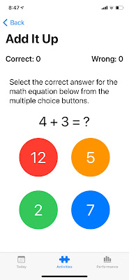
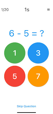
I wanted to make Word Share as minimal as possible.

One thing I noticed with a lot of competitor word games is that over time their UI has become cluttered. A typical competitor screen can have:

  • Daily bonus claim button
  • Social standing statistic (eg. Solved by 25% of players)
  • Currency counter and buy more currency button
  • Shuffle button
  • Use a hint button
  • Special power up button
  • Word definition button
  • Quest status button
  • Watch video for currency button
  • Banner ad

Below are some example screenshots.

Word Cookies example game screen

Word Trip example game screen

I added only what was necessary. 

Monetization

Word Share is a free game supported by ads.

I did debate over wether I should have a banner ad. For Snappy Word they account for  around 8% of revenue, which is still a reasonable amount of money. I decided to not have banner ads for a less cluttered screen. 

For the launch I went with interstitial ads between levels, and rewarded ads to earn 3 hints. I introduce the ads after the player has played a number of levels, and only show interstitials if they haven't used rewarded ads.

SharePlay

This game was built for SharePlay. Apple gave a great demo of SharePlay in one of their WWDC sessions and released sample code of the demo project. This was invaluable in getting up and running.

The biggest challenge I had was trying to figure out the best way to get players into the SharePlay experience. Because SharePlay was so new, there were no other games to look to for guidance or inspiration. So I had to make up the onboarding experience myself and hope that it was to Apple's liking!

I also had to figure out how a multi-player word game would work with FaceTime. How do you identify the users to each other? What is the scoring system like? Can players use hints while competing?

I opted for a simple system. A player starts a FaceTime call and then a big button appears on the front screen letting them know they can start a SharePlay game.

I decided on 3 rounds with the highest scoring player winning the game. Scores are based on 1 point per letter for a solved word. No hints are available to any players.

In my planning I was considering adding taunt buttons to the game - but quickly realised SharePlay is built on FaceTime - so players can smack talk each other, or even help each other using video and voice.

Building on a Foundation

I have another word game on the App Store called Snappy Word. This project began as an Apple Watch launch game and I wrote about it here: Making Snappy Word for Apple Watch

I updated Snappy Word to add in a new "swipe the letter to make a word" mode to keep up with the growing word game genre in the App Store. I used this existing codebase to help give me a headstart in making Word Share.

I took the base code for showing the unsolved word tiles and handling the word building input and added it to the new Word Share project. This code is built using the SpriteKit framework.

In my previous game I had used Storyboards for all the menu and UI screens, but for the new game I decided to use SwiftUI. I've used Flutter and SwiftUI a lot and I love reactive programming. It makes creating screens so much easier!

Storyboards for Level Select in Snappy Word


SwiftUI for Level Select in Word Share

I used the same level select screen format in Word Share as I did in Snappy Word. Writing it in SwiftUI took me around an hour compared to almost 2 days it took in Storyboards for Snappy Word. Of course that may just be me. For some reason I could never get my head around Storyboard and its use of constraints, layout margins, insets and all the stuff that had to be set inside the inspector. I love being able to lay out the UI in code which is why SwiftUI appeals to me.

I wrote about SwiftUI and Flutter here: Flutter vs SwiftUI

Since writing that blog post SwiftUI has seen a number of great improvements, and I have to say that I would rank Flutter and SwiftUI as both excellent choices for development with SwiftUI edging out Flutter in terms of ease of use and code simplicity, and Flutter edging out SwiftUI in terms of platform reach. I have another word game coming out soon that has been written in Flutter - expect a blog post about it when it launches!

I have to give a big shout out to James Swiney, another iOS developer from Brisbane, Australia who helped me get my head around using SpriteKit with SwiftUI. James had done a lot of the groundwork in his game Aruna's Adventure.

Visual Style

A big part of this genre of word game is the background images on each screen. I'm an Aussie developer, so for the images I chose a bunch of photos I had taken from my trips around Australia - with many of them taken around the suburb where I live.

I'm quite lucky that we have access to a lot of beautiful beaches - so the game is full of lots of sand and inviting blue waters :-)

It's great to have these views within driving distance :-)

I also chose yellow as the primary colour in the game. It pops well agains the predominately blue and green photos I chose.

The icon was a challenge. I did attempt to create something new and original but I settled on a simple W on a yellow background. I may update this but it's hard to get a word game icon that stands out from the rest.

Creating New Content

Another thing that helped speed up the development process is that I had created tools for Snappy Word that I could easily re-use and extend for Word Share. I built a bespoke app that would generate lists of anagrams from a dictionary, checking for duplicates and offering me the ability to output in a format that my game used.

This utility allowed me to create over 400 brand new levels for launch, with another 500 or so waiting for future updates.

I plan to add new level packs regularly and address any issues found by players.

Conclusion

I had a lot of fun making the game, and while implementing SharePlay was challenging, I'm proud of what I achieved. 

It was also great to get a New Games We Love feature from Apple in the launch week!

Thank you Apple!

Please check out Word Share on the App Store and let me know what you think!

Cheers,

John


Thursday, February 04, 2021

Flutter vs SwiftUI

It's a new year and time to make a new app.

So what do I build my new app in? SwiftUI or Flutter?

TL;DR - I'm making my new app in Flutter.

I arrived at this decision by making a vertical slice of the app using SwiftUI,  Flutter and standard Swift with SpriteKit.  

The app I'm building is an update of my Brainiversity brain training game. Brainiversity has a number of small games that test your math, memory and word skills. I've been making versions of this app since 2007, so I have code bases written in C++, ActionScript and Lua. I used the existing "Add It Up" mini-game for my vertical slice.

Swift and SpriteKit

Line count: 647
SpriteKit version

This version is very similar to the original C++, ActionScript and Lua versions. It uses sprite animations to give the game zing, and everything is imperative - so the text in the answer counter label in the top left of the screen is manually updated when a new question is generated. 

I found SKAction  was useful in handling animations. This made it really easy to chain together a sequence of events like:
  1. a cross appears when the user presses the wrong answer button,
  2. the correct answer scrolls in from the right of the screen,
  3. after a pause, answer counter pulses as it counts up one,
  4. the answer scrolls off screen to the left as a new question scrolls in from the right
  5. the buttons flop over to reveal new answer values.
Compared to the SwiftUI and Flutter versions, there was a lot of code to make stuff happen, and to be honest, after making apps with reactive UI, programming this way felt old fashioned.

SwiftUI

Line count: 210
SwiftUI version

I've already made a few apps in SwiftUI so I was used to the reactive paradigm. Reactive programming results in reduced code which makes reading the code so much easier. I love how SwiftUI handle state with the @State property wrapper - it seems a lot cleaner and less code than Flutter's SetState or Provider solutions.

The use of VStack, HStack and Spacer makes it really easy to lay out the screen. Here is the code to layout the question and the answer buttons.

   VStack {

      VStack {

        HStack {

          Text("Correct: \(correct)")

            .bold()

            .font(.system(size: width * 0.20))

          Spacer()

          Text("Wrong: \(mistakes)")

            .bold()

            .font(.system(size: width * 0.20))

        }.padding()

        Text("Select the correct answer for the math equation below from the multiple choice buttons.")

          .font(.system(size: width * 0.20))

          .padding()

        Text(question)

          .font(.system(size: width * 0.35))

        VStack {

          HStack {

            Spacer()

            RoundButton(title: "\(answer1)", color: Color.red, size: width, function: {tryAnswer(button: 1)})


            Spacer()

            RoundButton(title: "\(answer2)", color: Color.orange, size: width, function: {tryAnswer(button: 2)})


            Spacer()

          }.padding()


          HStack {

            Spacer()

            RoundButton(title: "\(answer3)", color: Color.green, size: width, function: {tryAnswer(button: 3)})


            Spacer()

            RoundButton(title: "\(answer4)", color: Color.blue, size: width, function: {tryAnswer(button: 4)})


            Spacer()

          }.padding()

        }

      }

      Spacer()

    }

    .navigationTitle("Add It Up")

    .onAppear {

      generateResults()

      width = UIScreen.main.bounds.width * 0.3

    }


This is fairly similar to Flutter, which uses Columns, Rows and Spacer - here is the button section code in Flutter:

return Column(
children: <Widget>[
Row(
mainAxisAlignment: MainAxisAlignment.center,
children: <Widget>[
answerButtonRound(
answer: answerList[0],
color: Colors.green,
size: buttonSize,
func: () => {_answerButtonPressed(buttonNr: 1)}),
answerButtonRound(
answer: answerList[1],
color: Colors.blue,
size: buttonSize,
func: () => {_answerButtonPressed(buttonNr: 2)}),
],
),
Row(
mainAxisAlignment: MainAxisAlignment.center,
children: <Widget>[
answerButtonRound(
answer: answerList[2],
color: Colors.red,
size: buttonSize,
func: () => {_answerButtonPressed(buttonNr: 2)}),
answerButtonRound(
answer: answerList[3],
color: Colors.orange,
size: buttonSize,
func: () => {_answerButtonPressed(buttonNr: 4)}),
],
),
],
);

Swift code is definitely a lot cleaner to read with less nesting and less boiler plate. The child and children parameters of Flutter take up extra space and cause more visual clutter.

I hit a brick wall with SwiftUI when I wanted to chain animations together with some state updates in the midst of all the action. I could not find a way to make the question label animate away, then update the state for new questions, then slide an updated question text back on screen. The best answer I could find was to start the slide out animation with a slide in animaion, then set a timer to call my generateNewQuestions() function so it occurred halfway between the slide in and out.

Maybe I didn't look hard enough for the right way to do this, but that's currently an issue with SwiftUI documentation. There's not much of it out there. Whereas I found multiple examples and tutorials on how to do what I wanted in Flutter on flutter.dev and other web sites.

Swift Pros

  • Light weight code that is easy to read. You can do a lot with so little.
  • Dark theme just works out of the box.
  • I can target Apple Watch.
  • CoreData is nice and works out of the box with Apple devices.
  • The state system is really easy to use.
  • No semi-colons!

Swift Cons

  • App Preview is slow to update, even on my M1 MacBook Air - and I constantly had to keep hitting Resume to rebuild the preview.
  • Documentation is lacking, especially compared to Flutter. Thank goodness for Hacking With Swift - the best resource for Swift developers.
  • Can only make apps for the Apple ecosystem.
  • Refactoring is less advanced than Flutter.

Flutter

Line count: 304
Flutter version


Even though Flutter has sightly more boilerplate code to set things up, I like how everything is a widget and it's pretty consistent. You generally nest widgets within widgets - and when you go too deep you refactor out into new widgets which makes for easier to read code. SwiftUI has nesting as well, but also has modifiers which I'm not 100% sold on.

In SwiftUI to make the text bold you add a .bold() modifier.

          Text("Wrong: \(mistakes)")

            .bold()


In Flutter you add the bold as part of a parameter of Text.

                        Text('Wrong $mistakes', style: TextStyle(fontWeight: FontWeight.bold)),

I guess what feels weird with SwiftUI modifiers is that to give a screen a title, you add the modifier at the bottom of the view - so when you read the code you aren't seeing the layout as it occurs. Whereas with Flutter, you add the screen title at the top so you read the screen in the order it's drawn. Maybe I'm being picky, but I found that a little weird.

Even though Flutter is a bit more wordy, I found it a lot easier to find out what modifiers are available by simply pressing CTRL-SPACE in VSCode. Maybe there is an easy way to find out what  modifiers are available for Text() in Xcode apart from going into the Library Panel and searching (which is a pain) - but I have yet to find it.

Another plus with Flutter is that it's so easy to refactor code. Are your widgets nested too deep? Turn them into a new reusable widget by hitting Refactor and choosing Extract to widget. Want to wrap everything in a new Row? Hit Refactor and choose Wrap with row. Want to get rid of a top level widget? Again, hit Refactor and choose Remove this widget.

Xcode has a refactor option, but doesn't offer as many features. 

In terms of Dart vs. Swift - I have to admit I found them fairly interchangeable and could happily switch between the two. Most of the stuff I am using to build my apps is common across both. All the modern language features like helper functions for lists such as sort, insert, and index functions were common to both and in many cases had the same name.

Flutter Pros

  • Hot reload is amazing. Instant updates on my actual target device makes development so much faster.
  • Great documentation. Not only is the documentation at Fluter.dev awesome, but there is a dedicated YouTube channel with lots of content including the useful Widget of the Week.
  • Lots of great packages at Pub.dev. The odds are, if you need something, there is a package already available. Want to add charting to your app? There's are many packages for that.
  • There is a Widget for literally everything. 
  • Refactoring with VSCode is super easy.
  • Supports a lot more legacy devices and older OS versions.
  • Can make apps for iOS, Android, Mac, Windows and web. My website, www.redspritestudios.com is written in Flutter :-)
  • Flutter is open source. So you can drill down into any piece of code to see how it works. There is no blackbox like Swift.

Flutter Cons

  • Can't build for Apple Watch :-(
  • 2D only. So no chance of doing any activities in 3D.
  • Slightly more verbose compared to SwiftUI.
  • State management is not as clear cut as SwiftUI.
  • I have to type a semi-colon at the end of every line.

Conclusion

I love SwiftUI and have already published apps built with SwiftUI. 

But, for my new app, Flutter has the edge. It has lots of widgets, a large amount of good quality documentation, cross-platform support, and an animation system that does what I need.

More importantly I actually found it a tad faster to build my vertical slice in Flutter. This was probably due to the abundance of quality documentation helping me solve roadblocks quickly, and having a faster feedback loop with hot-reloading.

I plan to get an MVP of the new Brainiversity up as soon as I can, and I will build out the rest of the activities with feedback from users. I'll post again when it's ready to play.

Let me know if I got anything wrong, or if there is a better way of doing things.

Cheers,
John


Monday, August 26, 2019

Third In The Space Watch Trilogy

WatchOS 6 is launching soon, and I've been busy preparing some new games exclusively for the Apple Watch.

I've already released Kepler Attack, a fast paced space shooter inspired by the arcade classic Gyruss, and I've recently completed Star Warp, which is now available for pre-order on the App Store. Star Warp will launch on the 4th of September and is inspired by Galaxians.

And right now I'm busy working on another space game -  the third in my Space Watch Trilogy - and that game is called Asteroid Commando. No prizes for guessing the inspiration for this one...


Like the other two games, Asteroid Commando is built using Swift 5 and SpriteKit and is designed to take advantage of all the latest features of the Apple Watch. It uses the Digital Crown with haptic feedback, runs at a silky smooth 60fps, works with Game Center for the Watch and runs independently of the iPhone.

I've built up a framework while developing Snappy Word, Kepler Attack and Star Warp - sharing a menu system, leaderboard and save/load system between games lets me kick off new projects and get into the core game a lot faster.

Initial sprite set for the game
I'm finding the constraints of the Apple Watch a joy to work with. The smaller screen size and limited input, coupled with the shorter play sessions means that a Watch game is much smaller in scope than the average mobile game. And this means shorter development times without compromising the quality of the experience. In some ways, the Watch is a great delivery platform for what is essentially paid hyper casual games.

I plan on doing more regular updates as I close out Asteroid Commando, so please check back to see the new features I'll be adding over the coming weeks.

Cheers,
Johnno